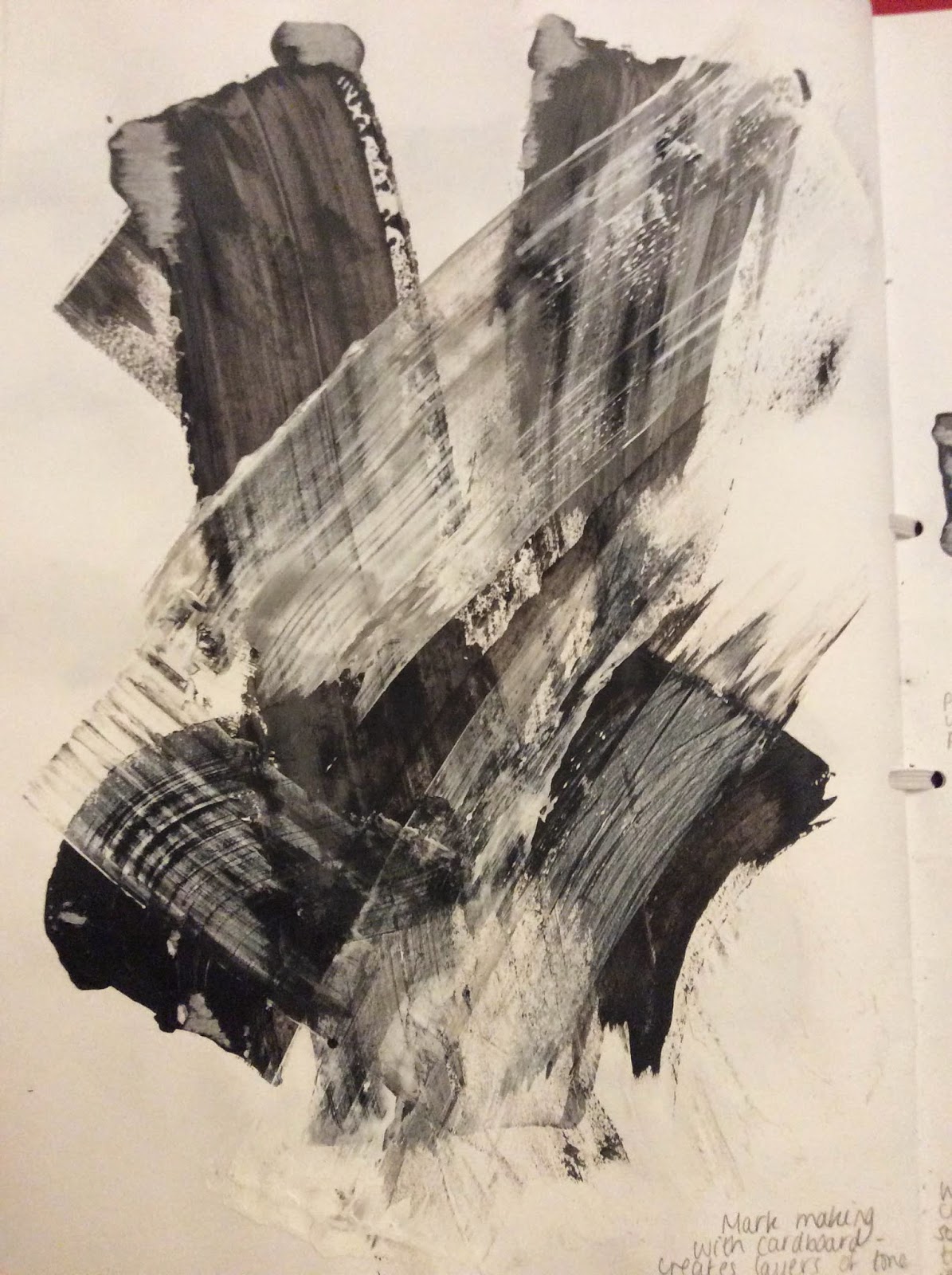
Looking at Henry Moore's drawings and paintings, he uses many different types of marks to create shape, tone and depth in his drawings. I noted down a few of the marks and patterns he uses that I found interesting using fine-liner and biro as I feel that these are what can change the whole outlook of a drawing. For example using straight lines as opposed to more of a scribbling technique can give the drawing a more smooth texture, rather than a rough and messy one.
Here I was looking at parts of Moore's 'Pink and Green Sleepers'. Using coloured pencils, I was looking at the way the lines curve to create shape and depth within the drawing. I also added bit of newspaper to them to create a slight collage, carrying on from the collage on the page before. On the blanket and the arm Moore has used lines that arch there way round to create the shape and the curves in the drawing.
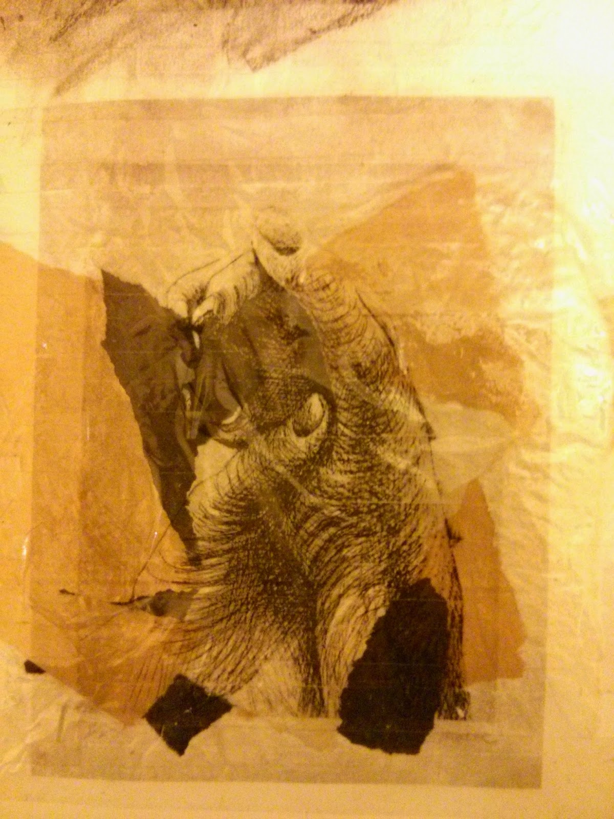
Using a fine-liner pen, I drew a hand similar to Moore's 'The Artist's Hands V', practising the mark making techniques that Moore uses. I think that these techniques worked well as they create tone and texture in the drawing, allowing the viewer to see the shape of the hand being created.
Around the sellotape, I decided to paint around it using earthly colours such as brown to link in with Goldsworthy's use of nature. I then stuck down paper cut into the shape of leaves to also give it the natural element.
I find that this piece does not work well because the use of materials do not reflect the ones that Goldsworthy would use in his pieces, such as real leaves, pebbles or sticks. To improve this, I will cover what I have done around it in white paint, and then use leaves or twigs to write out his name in order to reflect the materials that Goldsworthy uses.
Looking at Andy Goldsworthy's work, I noticed that lot of them included different shapes going down or up the gradient, then surrounding a hole. I decided to create a piece similar to this style, however using less natural resources and shapes. Using cardboard, I cut out squares and glued them into the places I wanted. I then painted them using dark red, orange and yellow showing a small gradient through the squares. I painted the middle black to show a strong contrast from the bright yellow, which represents the 'hole'. As before, this piece does not portray the mediums that Goldsworthy would use, so is not a good representation of his work.
Here I was looking at Andy Goldsworthy's 'Pebbles Broken and Scraped'. I drew this using a pencil, smudging tool and a rubber. As above, this piece is also not a good representation of his work as pencil is not a medium Goldsworthy would use. To improve the page that this is on, I will use a transfer technique of my own piece (below) and one of Goldsworthy's pieces on top to show the differences in colour.
Here I collected some leaves and arranged them in a circle in my sketchbook, the lighter colours on the outside and the darker ones on the inside.
After attempting to stick them down with glue, I decided to use sellotape as the glue did not work. I feel that this has affected the texture of the piece because the leaves are under the layer of sellotape. This takes away the 3D feel of it, as well as the proper shape the leaves have. However, here the use of leaves portrays one of the mediums that Goldsworthy would use, so is therefore a better representation of his work.
This is the complete page - I photocopied the arrangement of the leaves I collected and created a transferred image onto sellotape, finally sticking a sellotape transfer of Goldsworthy's 'Rowan Leaves Around a Hole' on top of it to create a layer of colour. I did a similar thing with the leaves underneath, however stuck Goldsworthy's image on top to show a different kind of contrast.
Improvements:
To improve the Andy Goldsworthy page, I painted over the brown paint and the paper leaves with white acrylic paint so that it couldn't be seen anymore. I then used twigs that I had collected to spell out Andy Goldsworthy's name. I feel that this works better as it uses mainly natural materials and suits his style more.
Rather than ripping the page out of the sketchbook, I ripped out the pieces of cardboard, which left interesting shapes on the page which I thought would be a good background for some more studies of Henry Moore's work. At the top of the page I drew from a picture I had taken of my own hand with a biro pen. I used some of the same techniques as Moore did, such as cross-hatching and scribbling.
Underneath this, I used the collage technique again with newspaper, to contrast the newspaper collage surrounding the pencil drawn hand I did earlier. Again, I used an image of my own hand to make it original.
To further study Andy Goldsworthy's work, I decided to create another shape in my sketchbook using leaves. I used dark purple, green, orange and yellow leaves and blended them so that there was a graduating colour change. I think this piece works well because it links well with the style of Goldsworthy's work as I have used natural materials and bold and vibrant colours.
I feel that I am not working well with Andy Goldsworthy's work as it is difficult for me to create art in the style of his work. Most of the pieces should be created outside as they are natural materials so don;t last forever. It is difficult to produce work like his in a sketch book, so I think I will change my artist to one that is more similar to the works of Henry Moore.