Friday 19 December 2014

Egon Schiele Studies

I decided that I wanted to carry on with the subject of hands, so chose the artist Egon Schiele as the main focus in a lot of his works are of the face and the hands. I like the intricacy he portrays with hands as he makes the knuckles very prominent, looking at the aged body and showing how it has been worn and tired out. 


Here I drew the hands from Schiele's 'Self Portrait with Hands on Chest' using watercolours and a biro pen. I like the use of warm colours in this, as well as the blending on tones. I think that the use of similar, yet unnatural tones in this piece give it a sense of being unique and different. 


Looking at another one of Schiele's works, I chose 'Self Portrait, Grimacing' and drew a study of the hand in it using watercolours and a fine-liner. I like this piece because of the use of more dull tones and expressive lines, which both make the hand seem old and ragged. They show how the hand has been worn down over time. 

Experimenting with Different Materials and Textures


Looking at creating different textures, I decided to create a texture that would make the page look as if has been scrunched up. To do this I stuck down scrunched up newspaper, and painted over it with emulsion to create a very rough texture. I then used an ochre yellow watercolour over the top to make it look more old and worn. I then drew from a photo I had taken earlier over the top with biro and watercolour. It was quite difficult to draw over the top of it because of how uneven the surface is, however I think that it works well and that I got the look I wanted to achieve. 


For a more simple textured base, I painted the page with emulsion with a large paintbrush in different directions, leaving lines that had been created for the strokes. Over the top I drew Schiele's hand from 'Self Portrait with Raised Arms' using oil pastels for the colours, and charcoal for the outline. Around the hand I stained the page with coffee to add more tones similar to the ones used in 'Self Portrait with Hands on Chest'. I think this works well and would like to do more studies using this texture as I like the lines it creates in the charcoal and oil pastels. 


Using the same texture base as before, I used some photos I had taken of my own hands to try out some different materials on this texture. 


For this hand I used the same use of oil pastels and charcoal as the previous one, however this time I primarily painted over the hand with coffee to give it a different tone than the white used before. I think this works well because of the different tones used and the textures that have been created. 


Here I cut down again to using only one material. I used a fine-liner to create expressive lines showing the shape and direction of the hand, as shown in Schiele's 'Self Portrait, Grimacing' - the delicacy of the lines show how the hand has been worn down over time. 


Here I used similar colours to those in Schiele's 'Self Portrait with Hand on Chest' with watercolours, as well as using a scribbling technique with a fine-liner, in resemblance to what I did with Antonio Lopez Garcia's 'Gloved Hands'. I think that this would have worked better if I used a biro instead of a fine-liner, because the fine-liner looks too thick and heavy, almost like a felt tip pen, and using a biro would give it a more intricate look because it is thinner and more light. 


To create a more subtle use of newspaper for a textural base, I glued newspaper to the page, and then moved it around to create rips and folds as it dried. After this painted over it with emulsion. This gave it a more subtle texture than before, making it easier to draw over the top. Again, for this piece I used coffee, oil pastels and watercolours for the hands, and then a fine-liner for the background. I like the idea of the expressive lines in the background, however as before, I think that they are too thick and should have been drawn with a biro instead. I also found that that the hands in this drawing looked very cartoon-like, which was not the look I was going for. 

Despite this, I would like to use this image using different materials and techniques as I like how old it is and the way it stands out. It could be a possible subject for my final piece:


Thursday 18 December 2014

Printing Techniques


For this printing technique I used a sheet of polystyrene and a biro which created marks in the polystyrene. I then painted over it with a roller, then pressed it face down onto the paper. With this technique, I like the grainy effect it is given, as well as how clear the lines in the drawing have come out.


This painting technique was done by painting onto a laminated sheet of paper, then using the end of a paintbrush, I created marks to contrast white and black. I then pressed it face down onto paper to print it. The outcome is very expressive, and could be used in an abstract piece.


Here I used the same technique as before, however with the end of a paintbrush I drew a hand. I like the marks that have been made, particularly the paint in the background, however I don't think that the drawing works in it as there is too much of a contrast between being expressive and being very controlled. I think this technique would work better as a more abstract or expressive piece.


For this printing technique I painted onto a laminated paper with a roller, placed it faced down onto paper and then drew over it with the end of a paintbrush. I like the outlook of this technique because the lines are not sharp, and look as if they could be used for drawing things like the blurry outlines of buildings in the background for example.


 This technique was done by painting onto laminated paper with a roller, then stripping away layers of paint with a cloth so some parts are left white again. I then pressed it face down onto paper to print it. I like this technique because it creates an interesting effect, and there are a lot of different ways you can experiment with it. 


Saturday 6 December 2014

Egon Schiele Artist Research and Analysis


Egon Schiele was born on June 12 in 1890 in Austria. His father, Adolf Schiele, was the train master of the Tulin Station in the Austrian State Railways. As a child, Schiele loved trains, and he would spend a lot of time drawing them, much to his father's disappointment. When he was 11 year old, Schiele moved to Krems, Austria to go to secondary school. To others he was seen as a strange child; he was shy and reserved, didn't do well in most subjects others than athletics and drawing and was usually in classes with younger pupils. He also displayed incestuous tendencies towards his younger sister Gertrude. When he was 15 years old, his father died or syphilis and his uncle took care of him. Schiele's uncle was also a railway official, and despite his uncle wanted him to follow in his footsteps, he recognised Schiele's talent for drawing and half-heartedly allowed him a tutor. In 1906, Schiele applied for a School of Arts and Crafts in Vienna. That same year, he was sent to the more traditional Akademie de Bildenden Künste in Vienna. The teaching style of his teacher left Schiele and the other students frustrated and dissatisfied, causing him to leave three years later. 

In 1907, Schiele was mentored by Gustav Klimt, who was very keen on his work and style. His first exhibition was held in Klosterneuburg in 1908. After leaving the Academy in 1909, Klimt invited him to exhibit his work at Vienna Kunstechau, along with the works of Edvard Munch, Jan Toorop, and Vincent van Gogh. At that time, he had begun to explore human sexuality as well as the human form, and many people found the explicitness of his works disturbing.

In 1911 Schiele met Walburga Neuzil (also known as Wally), who was seventeen years old. They lived together in Vienna and Wally served as a model for his paintings. After moving to and being driven out of Krumau, the two moved to Neulengbach where they found a studio in which Schiele could work in. The studio became very popular with the curious children of Neulengbach, however in April 1912' Schiele was arrested for seducing a young girl. While arresting him, the police found over one hundred drawings in his studio that they considered pornographic. In his trial, the charges of seduction and abduction were dropped, but he was found guilty of displaying suggestive drawings in a place accessible to children. He served up to twenty four days in prison.

Schiele met a woman name Edith Harms in 1914, and then married her in 1915. He presumed that his relationship with Wally would carry on, but after telling her she left immediately and was never seen again. This prompted him to paint 'Death and the Maiden'.

Three days after the wedding, Schiele was ordered to report for active service in the army due to the outbreak of World War I. He was stationed in Prague and Edith had to stay in a nearby hotel, where they were able to see each other occasionally. After a while, Schiele was given a job as a clerk in a POW camp near Mühling. Many of his exhibitions still went on while Schiele was in Prague in many different countries. Schiele's commander, Karl Moser knew of his artistic talents, so gave him a place where he could work, and he drew and painted imprisoned Russian officers. In 1917 Schiele and his wife moved back to Vienna and he focused again on his career in art. The prices of his works increased after an exhibition show in Vienna and he received many portrait assignments.

The Spanish flu outbreak reached Vienna in 1918, causing both Edith and Schiele to fall ill. Edith was six months pregnant when she died on 28th October. Schiele died from the disease three days later at 28 years old. During the three days after Edith's death, Schiele drew some sketches of her - these were his last works. 

Analysis of 'Self Portrait with Arm Twisted Above Head' and 'Portrait of Edith Schiele in a Striped Dress'


Egon Schiele
'Self Portrait with Arm Twisted Above Head' (1910)
Watercolour and charcoal

This painting shows Schiele with his right arm twisted around his head, his expression showing a grimace. The lines, tones, texture and colours all add up to the form of this piece. they all give it a 3D quality, making it more bold and eye-catching. The lines used in this piece give it shape and show the contouring of the body and face. The tones in this piece are very similar - there is not much of a contrast in colours other than in the hair which is the darkest tone. Also the hand is a lot darker than the rest of the body, creating a contrast. The main colours in this are brown and black. There are some hints of red in some places, and yellow undertones in the skin, as opposed to the background which has more pink undertones. The different lines and shapes created on the face and hand convey a more rough and edgy texture, whereas the lines on the body create a smoother texture. 

The composition of this piece shows Schiele standing in the middle, covering most of the canvas, showing that he is the main focus of the piece. The curve of the back and the straightness of his left arm leads the viewer's eye in to the more detailed face and hands.

In many of Schiele's works he focuses on the hand and face. He changes the hands to make them distorted, accentuating the knuckles and bones, making them more prominent. Also the way he draws skin, particularly on the face, the shapes he uses are very noticeable - they stand out, making the skin look more edgy and old, showing meaning behind what is really there. This is different to what Schiele's mentor, Gustav Klimt's style was. Klimt created smooth and graceful contours in his pieces, where the skin was soft and elegant, however the lines Schiele used are very sharp and distinguishable.

I would like to use this style in my own work, especially in the hands, making the bones and knuckles more prominent and using similar tones to the ones that Schiele uses.


Egon Schiele
'Portrait of Edith Schiele in a Striped Dress' (1915)
Oil on canvas

This painting shows Schiele's wife, Edith, standing in an upright position with her arms by her side and her feet shoulder-width apart. She has her hair up and is wearing a long, colourful, striped dress. Due to the size of this piece (1.80m x 1.10m), Schiele was forced to paint his subject bigger so that the main focus of the piece is her. The direction of the stripes on the dress give the piece more of a 3D look because they show the folds and creases of the dress. Also the angles of the lines on the sleeves of her dress show the creases, giving it a more 3D effect. The tones of Edith's skin, sleeves and background are very similar to each other, with not much contrast of light and dark. Schiele used only a subtly darker colour to create the darker tones of her face and lighter parts of her dress. This contrasts to the more bold colours on the stripes of her dress, where he has used both primary and secondary colours. These colours are mainly darker than the skin and background, as well as more prominent, drawing the viewer's eye to the boldness of the dress. 

The composition of this piece shows Edith standing in the middle of the canvas with a plain background, showing how she is the main focus of the piece. Also the direction of the lines on her dress show a downwards movement, therefore leading the viewer's eye to the middle of the dress where the belt is, as this is the point where the direction of the lines change, so the focus is mainly on her dress. 

This piece is very different to many of Schiele's works, because the main focus is on what the subject is wearing, and not on the hands or face. The bold and vibrant colours in the dress contradict the dull, pale colours surrounding her creating a different mood in the painting altogether. Also the way she is standing perhaps suggests that she is isolated from her surroundings, and stuck in the world she is living in. 

This is a style I would like to use I my own work because I like the use of contrasting vibrant colours with pale ones, as well as using lines to draw the viewer's eye onto where I want the focus of the piece to be. 

Thursday 20 November 2014

Using Paint and Colour

During the last few lessons we have started to learn about colour. The primary colours - red, yellow and blue - are the colours that cannot be made by any other colour. Secondary colours are made by mixing two primary colours together - orange, green and purple are all secondary colours. 


Using water thins out the paint - the more water that is used the more translucent the paint is. Water does not change the tone of paint, however mixing it with black or white does. 


There are many different types of marks you can make when using paint, using different materials with it. For example, here we dipped cardboard into paint, spreading it across the paper. This creates an almost abstract mark, leaving trails of patterns behind it.


Using black, white and grey paint, I used cardboard to create an abstract piece using these marks. I like the lines that the cardboard creates, as well as the texture that it gives to the paint.


Here we used sponge to create different marks. This was different to the cardboard because the sponge soaks up the moisture, making the paint spread further, whereas with the cardboard, it didn't spread very far unless a lot of paint was put on it. I used a dabbing technique to create a different effect. This technique creates a different texture and could be used for producing picture such as clouds, mist, trees etc. 


Using a paintbrush creates a different outlook. For example, the lines created are thinner, and are less textures. Using a paintbrush works well for painting more detailed parts of paintings, as well as creating more lines and shape of the piece.


Monday 10 November 2014

Henry Moore and Andy Goldsworthy Sketchbook Studies


Looking at Henry Moore's drawings and paintings, he uses many different types of marks to create shape, tone and depth in his drawings. I noted down a few of the marks and patterns he uses that I found interesting using fine-liner and biro as I feel that these are what can change the whole outlook of a drawing. For example using straight lines as opposed to more of a scribbling technique can give the drawing a more smooth texture, rather than a rough and messy one.


Here I was looking at parts of Moore's 'Pink and Green Sleepers'. Using coloured pencils, I was looking at the way the lines curve to create shape and depth within the drawing. I also added bit of newspaper to them to create a slight collage, carrying on from the collage on the page before. On the blanket and the arm Moore has used lines that arch there way round to create the shape and the curves in the drawing.


Using a fine-liner pen, I drew a hand similar to Moore's 'The Artist's Hands V', practising the mark making techniques that Moore uses. I think that these techniques worked well as they create tone and texture in the drawing, allowing the viewer to see the shape of the hand being created.


Around the sellotape, I decided to paint around it using earthly colours such as brown to link in with Goldsworthy's use of nature. I then stuck down paper cut into the shape of leaves to also give it the natural element. 

I find that this piece does not work well because the use of materials do not reflect the ones that Goldsworthy would use in his pieces, such as real leaves, pebbles or sticks. To improve this, I will cover what I have done around it in white paint, and then use leaves or twigs to write out his name in order to reflect the materials that Goldsworthy uses.


Looking at Andy Goldsworthy's work, I noticed that lot of them included different shapes going down or up the gradient, then surrounding a hole. I decided to create a piece similar to this style, however using less natural resources and shapes. Using cardboard, I cut out squares and glued them into the places I wanted. I then painted them using dark red, orange and yellow showing a small gradient through the squares. I painted the middle black to show a strong contrast from the bright yellow, which represents the 'hole'. As before, this piece does not portray the mediums that Goldsworthy would use, so is not a good representation of his work. 


Here I was looking at Andy Goldsworthy's 'Pebbles Broken and Scraped'. I drew this using a pencil, smudging tool and a rubber. As above, this piece is also not a good representation of his work as pencil is not a medium Goldsworthy would use. To improve the page that this is on, I will use a transfer technique of my own piece (below) and one of Goldsworthy's pieces on top to show the differences in colour.


Here I collected some leaves and arranged them in a circle in my sketchbook, the lighter colours on the outside and the darker ones on the inside. 
After attempting to stick them down with glue, I decided to use sellotape as the glue did not work. I feel that this has affected the texture of the piece because the leaves are under the layer of sellotape. This takes away the 3D feel of it, as well as the proper shape the leaves have. However, here the use of leaves portrays one of the mediums that Goldsworthy would use, so is therefore a better representation of his work.


This is the complete page - I photocopied the arrangement of the leaves I collected and created a transferred image onto sellotape, finally sticking a sellotape transfer of Goldsworthy's 'Rowan Leaves Around a Hole' on top of it to create a layer of colour. I did a similar thing with the leaves underneath, however stuck Goldsworthy's image on top to show a different kind of contrast.


Improvements:


To improve the Andy Goldsworthy page, I painted over the brown paint and the paper leaves with white acrylic paint so that it couldn't be seen anymore. I then used twigs that I had collected to spell out Andy Goldsworthy's name. I feel that this works better as it uses mainly natural materials and suits his style more. 


Rather than ripping the page out of the sketchbook, I ripped out the pieces of cardboard, which left interesting shapes on the page which I thought would be a good background for some more studies of Henry Moore's work. At the top of the page I drew from a picture I had taken of my own hand with a biro pen. I used some of the same techniques as Moore did, such as cross-hatching and scribbling.

Underneath this, I used the collage technique again with newspaper, to contrast the newspaper collage surrounding the pencil drawn hand I did earlier. Again, I used an image of my own hand to make it original.


To further study Andy Goldsworthy's work, I decided to create another shape in my sketchbook using leaves. I used dark purple, green, orange and yellow leaves and blended them so that there was a graduating colour change. I think this piece works well because it links well with the style of Goldsworthy's work as I have used natural materials and bold and vibrant colours.


I feel that I am not working well with Andy Goldsworthy's work as it is difficult for me to create art in the style of his work. Most of the pieces should be created outside as they are natural materials so don;t last forever.  It is difficult to produce work like his in a sketch book, so I think I will change my artist to one that is more similar to the works of Henry Moore. 

Transfer Activities


'Pebbles Around a Hole' (1987)
Andy Goldsworthy

Using this piece by Andy Goldsworthy, I decided to use a transfer technique that we were shown in class to further represent the idea of 'layers'. After printing out the picture in black and white, I stuck sellotape over the image so that it was completely covered:


After doing this I  soaked the image in water, then began to strip away the layer of paper with a sponge:

As you can see in the images above, the ink has been transferred to the sellotape, and where the areas were white in the original image, it has become transparent. 


After cutting put a hole in my sketchbook, I stuck the transferred piece in the middle so that you can see through it, almost like a window. Around this I painted the background with acrylic paint and then used paper from another transfer technique that give the look of falling leaves. 

 Here is another transfer technique that we were shown in class. Using paper that had been painted with fabric paint, I cut it out into the shape of leaves as they are a material frequently used by Goldsworthy. Placing them face down onto canvas material, I ironed over it until the colour had transferred from the paper to the material. I then stuck this underneath the sellotape transfer (as shown above) so that the colour showed up through the black and white.


Using Henry Moore's 'The Artist's Hands IV' (1979), I did another transfer onto sellotape and stuck it into my sketchbook after smudging some charcoal underneath. I think that this works well because it brings a further depth to the image rather than having a plain white background.

Using the same image, I did a collage of different coloured and textured paper underneath which brings some colour to the image as well as adding some tone to the actual drawing.

Overall, I think that both of these transfer techniques work well because they both give the original drawings a different perspective and outlook, giving different layers of tone and shape, allowing space for experimentation.


Friday 31 October 2014

Research task - Henry Moore and Andy Goldsworthy

Henry Moore
 'Pink and Green Sleepers' (1941)
Henry Moore
Graphite, ink, gouache and wax on paper

'Mother and Child' (1949)
Henry Moore
Bronze

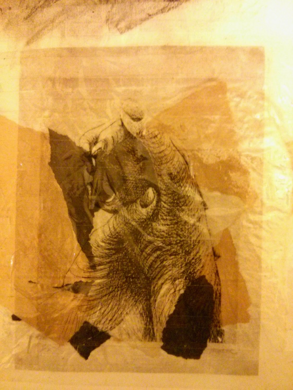
 'The Artist's Hands II' (c. 1979)
Henry Moore
Etching on paper

'The Artist's Hands II' analysis
Henry Moore was born in July 1898 in Castleford, Yorkshire, and died in August 1986 at the age of 88. He was alive during both the first and second World Wars, and many of his works are based on his past experiences of the wars. He is most famous for his sculptures, drawings, graphics and textiles. His father, Raymond Spencer Moore did not want his sons to work in the mines, but rather to have a formal education. In primary school Henry began modelling in clay and carving in wood, and decided there that he wanted to become a sculptor. He developed a good understanding of art from his art teacher in Castleford Grammar school, however, later his parents decided that they did not want him to be a sculptor, so at 18 years old he volunteered for the army service. In 1917 he was injured in a gas attack during the Battle of Cambrai, so he spent the rest of the war as a personal training instructor. After the war, he received an ex-serviceman's grant to continue his education at the Leeds School of Art. As he returned to London, he accepted a seven-year teaching job at the Royal College of Art. There he met Irina Radetsky, a painting student at the college, and they married in 1929. After six years of teaching at the Royal College, Moore assumed the role of the Head of the Department of Sculpture in the Chelsea School of Art. Due to the outbreak of World War Two, the school was evacuated to Northampton and Moore resigned from teaching. During the war, he produced powerful drawings of Londoners sleeping in the London Underground whilst sheltering from the Blitz. These drawings helped to boost Moore's International reputation, particularly in America. After the war, Irina had a child named Mary in 1946. Due to the loss of his mother and several miscarriages, Moore produced many artworks of a mother and child.

Moore's inspirations came from natural forms from the earth. He believed that works had to have an energy, or life of its own. It had to be independent, unique and interesting. Things like the nature influenced him to create beautiful sculptures like he did. 

In 'The Artist's Hands II', Henry Moore has used pen to create a beautiful drawing of one hand in another. Moore has used lines in many different directions to create the shape and tone of the hands. For the background he has used a scribbling technique that is dark by the hands and gets lighter further out. The centre point is just below one of the knuckles of one of the hands that is holding the other.

The formal elements, such as form, line, tone, colour and texture, in this piece have been used in many different ways to create a unique and interesting drawing. Due to its small size (190x254mm), its form is different to how it would be if it was larger. This has caused the hands to be drawn larger so that the focus is more on them. He has used cross-hatching and a scribbling technique to put more emphasis on the dark and light areas, making it more bold. Moore has used linear mark making,drawing lines in different directions to create the shape of the hands as well as the tones. There are no lines defining the outline of the hands, making it look more realistic.
On the back of the hand, Moore has drawn the lines more dense and closer together, to give the illusion that it is darker; however, on the other hand there are less lines and is less cross-hatching, giving the impression that it is lighter, showing a contrast between light and dark. For the background, Moore has used a mixture of the two, subtly graduating the layering of many different densities to represent the shadow that the hands have created. The use of black and white in this piece gives the drawing its contrast. The contradiction between light and dark i the drawing is shown more early through the use of black ad white. Moore's use of pen onto paper creates thin lines, some dense, some spread out, creating a rough, messy texture, as opposed to the smooth texture a medium such as charcoal would create.

The centre of the drawing is just underneath the first knuckle of the hand, which is white, immediately conveying the strong contrast between light and dark. Both arms come from each of the bottom corners of the page, joining in the middle, leading the viewer's eye to the main subject of the piece, which represents a strong bond and unity.

Moore's subject is the aged body. He did many drawings similar to this in 1979 of his own hands when he was eighty-one years old and was not very well. He quoted; "Hands convey so much, they can beg or refuse, take or give, be open or clenched, show content or anxiety. They can be young or old, beautiful or deformed".  The drawing is portraying the beauty of hands, not just physically, but in many ways they can be used.

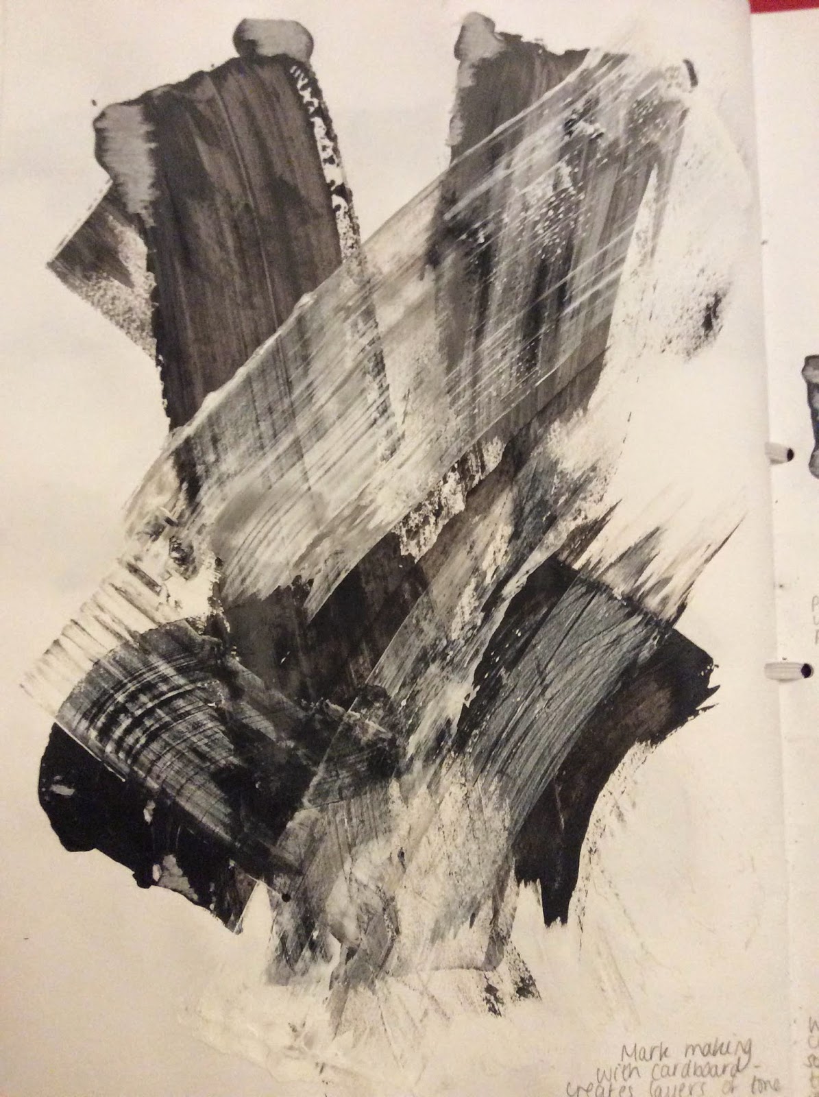
This piece of work could relate back to the theme of 'layers' because of the layers of tone that is created through the build up of lines and texture. I also like the style that has been used because it shows free movement and creates lots of texture in the drawing. For future pieces of work, I would like to create a piece using a similar style and subject to this, linking it back to 'layers' by creating shape through tones and lines.

Andy Goldsworthy


'Pebbles Broken and Scraped' (1985)
Andy Goldsworthy


'Sticks Framing a Lake' (2003)
Andy Goldsworthy

 'Rowan Leaves Laid Around a Hole' (1987)
Andy Goldsworthy

'Rowan Leaves Laid Around a Hole' analysis
Andy Goldsworthy was born in July 1956 in Cheshire. From the age of 13 he worked on farms as a labourer, allowing him to spend lots of time outdoors, living with the nature. He associated the repetitive quality of farm tasks to the routine of making sculptures. Goldsworthy studied fine art at Bradford College of Art and received his Bachelor of arts degree after studying at Preston Polytechnic. Photography is a very important part of his work because of its impermanent state. He stated, "Each work grows, stays, decays - integral parts of a cycle which the photograph shows at its heights, marking the moment when work is most alive. There is an intensity about a work at its peak that I hope is expressed in the image. Process and decay are implicit." 

In 1982, he married Judith Gregson, and they had four children together. The couple later separated, and Goldsworthy now lives in the village of Penpont with his partner Tina Fiske. 

Goldsworthy has had many exhibitions and installations between the years of 1996 and 2012 all around the world including the UK, Australia, America, Brazil and France.He has won many awards including the Northern Arts Award and was appointed officer of the Order of the British Empire In 2000.

Goldsworthy only used materials from the natural environment, including flowers, icicles, leaves, mud, pinecones, snow, stone, twigs and thorns.

In Goldsworthy's 'Rowan Leaves Laid Around a Hole' you can see layers of rowan leaves placed in a circle shape around a hole in the ground which is in the centre. The colours of the leaves change as they go further out, starting at yellow, going to orange, then red, then a darker red or purple.

The formal elements used in this piece are very different to the ones used in Henry Moore's drawing. Goldsworthy has placed the leaves around the hole perfectly to create a circle in the middle, and the leaves are positioned so that they keep that circular shape throughout. The artist has created a gradual increase of colour intensity, starting with dark red, then increasing to a bright yellow. The tone of the luminous yellow compared to the dark black hole creates a strong contrast, capturing the viewer's eye. The colours are extremely well blended and create a strong visual impact.

The centre of the piece is a black hole in the ground, surrounding this are brightly coloured leaves that create a strong contrast of light and dark. The circle shape of the hole is kept throughout as the leaves get darker and further away. The contrast in the middle captures the viewer's eye.

The colours and contrast in this piece overall remind me of an eclipse. The fact that nothing is manmade in the work represents the beauty of nature and how it has grown. The fact that it is a temporary piece of art could be portraying how nothing beautiful lasts forever, and that it will go when the seasons change.

This work could relate to the theme of 'layers' because of its physical connotations - the layers of leaves, tone and colour, as well as its metaphorical connotations - layers of nature, beauty and time.


 Comparison between Henry Moore's 'The Artist's Hands II' and Andy Goldsworthy's 'Rowan Leaves Laid Around a Hole'
Both artworks have similar textures which have been created in different ways. In Moore's drawing he uses cross-hatching and a scribbling technique, creating a rough texture. A rough texture is also created in Goldsworthy's piece because of the unevenness of the leaves that have been placed there. Both works have strong contrasting colours. As Moore's is in black and white, there is a great difference between light and dark, and there is a lot of blending of the two colours, causing some parts of the drawing to look grey. This is similar to Goldsworthy's piece in which he has used a strong dissimilarity in light and dark, however, he has also used colour to show an even greater contradiction between the bold, vibrant yellow and the dark black. 

One of the differences between the two is the materials that have been used to create each piece. Goldsworthy has used leaves that have been placed on the ground in an ephemeral state - they could be washed or blown away at any time, and if they are not then over time the leaves will decompose - the piece is only temporary. In contrast, Henry Moore's piece was drawn with pen onto paper, which is a permanent action, as it is sending a different meaning compared to the one Goldsworthy's piece is sending.